The 10 Best Book Covers
of January
Are We There Yet?
Another month of books, another month of book covers. Yes, January 2021 has only been a month. But it seems like it just might get a little bit better from here. In the meantime, here are some good things you can count on: a collection of dark, funny, complex book covers that would look just as nice on your walls as they would on your shelves. (You can also, you know, read them.) Below, my favorite covers from the month—and as always, feel free to add your own to the list in the comments.
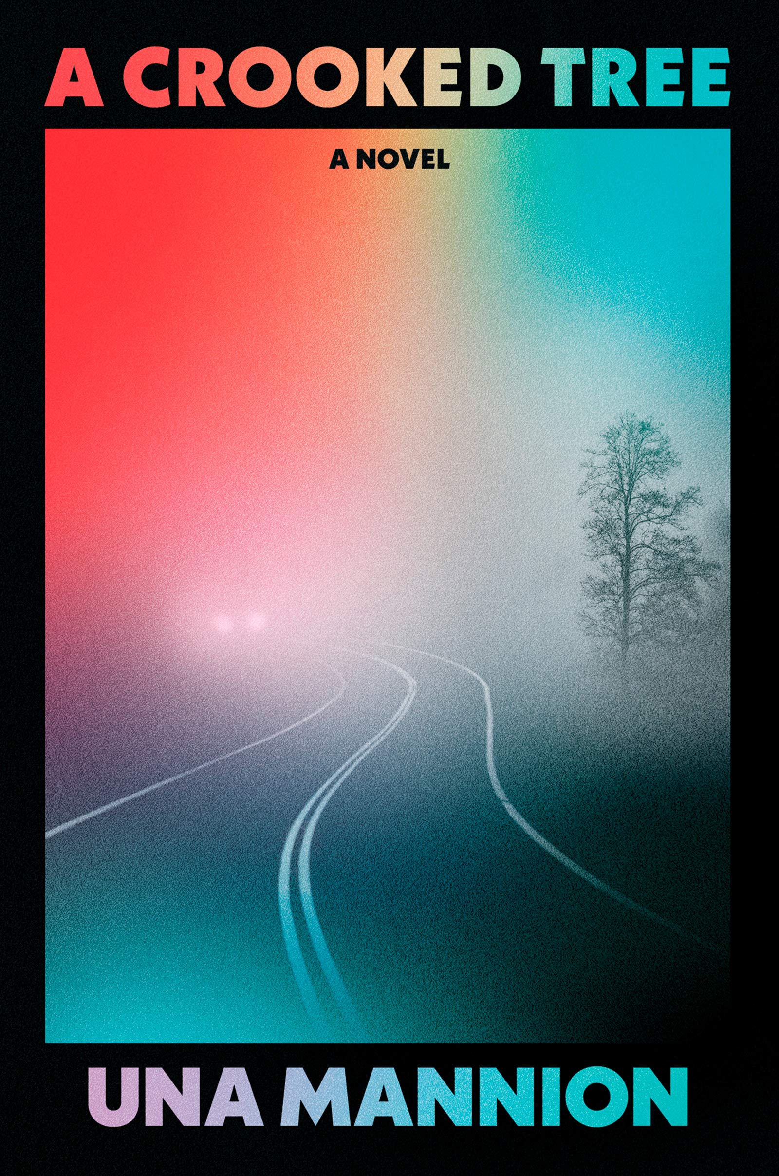 Una Mannion, A Crooked Tree; cover design by Caroline Johnson (Harper, January 5)
Whether or not the grimy rainbow actually turns out to be the biggest book cover trend of the year, I think this is my favorite version: I love the black frame, the depth, and the aura of mystery. Also, not for nothing, but it reminds me intensely of that scratch-off rainbow paper that I might or might not have been obsessed with as a child in the 90s.
 Anna North, Outlawed; cover design by Rachel Willey (Bloomsbury, January 5)
I mean, how can you not love it? The cheeky western-but-make-it-pink type treatment, the floating clouds, the cut out face, the lips! The lips, you guys. This is probably the cover that gives me the most plain joy this month.
 Michael Leviton, To Be Honest; cover design by Eli Mock (Harry N. Abrams, January 5)
I love how the torn paper effect here connotes, but does not denote, speech bubbles, and also the way it looks almost badly, or at least hastily, done—some of the text doesn’t quite make it. That is, it looks a little bit the way saying “To be honest” feels. (Funnily enough, this has a similar color story as the cover above (minus the pink), but it’s bringing an entirely different vibe, if a similar amount of irreverence.)
 Mariana Enriquez, tr. Megan McDowell, The Dangers of Smoking In Bed; cover design by Donna Cheng (Hogarth Press, January 12)
Obviously, it’s all about the figure here—but also the unusual type treatment, and the way “stories” dances across those weird red feet. It’s the kind of cover that instantly evokes a mood. The UK cover also slaps.
 Torrey Peters, Detransition, Baby, One World (January 12)
I quite like the subtly off-kilter brights here, and the way a layered, repeated image is used to create a textured pattern. The translucent text is a nice touch, as is the way it tucks into the eye details (especially that “A Novel”). Plus it’s got Big Book Vibes, which I always like to see done well and non-obviously.
 Rich Cohen, Pee Wees, FSG (January 12)
It’s just exactly what you think about when you think about Pee Wees. And then there’s the puck, coming straight for your face.
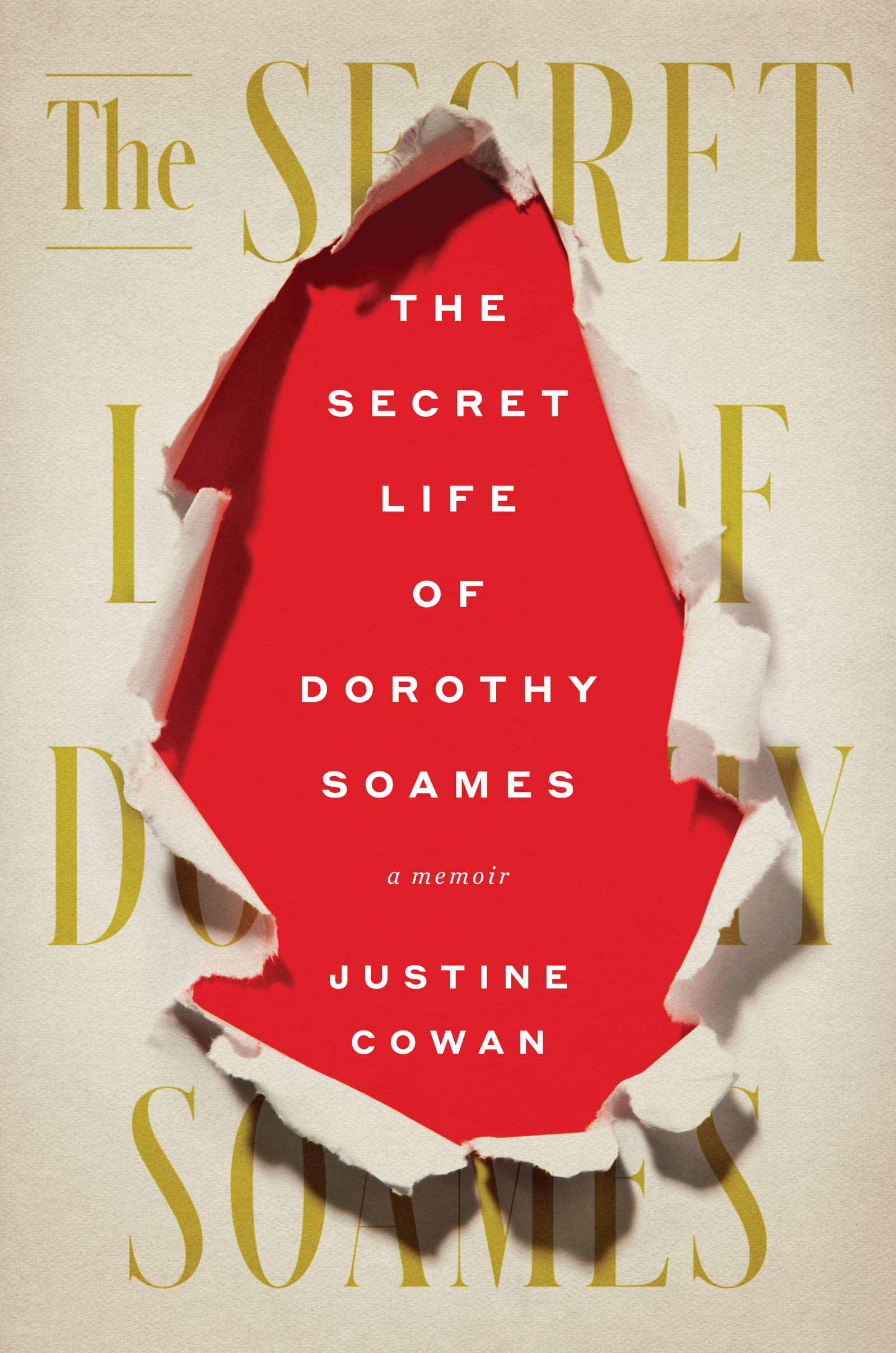 Justine Cowan, The Secret Life of Dorothy Soames; cover design by Mark Melnick (Harper, January 12)
You all know I love a good trompe l’oeil, but this one is particularly good because of the sense it gives you of an outdated cover—that huge, 80s serif font and coloring—being replaced by a more contemporary one. Like all of the very best covers, it makes me want to find out what kind of book would inspire such a treatment.
 Ellie Eaton, The Divines; cover design by Mumtaz Mustafa, cover art by Beth Hoeckel (William Morrow, January 19)
This one isn’t quite fair, because I am a devoted Beth Hoeckel fan, but hey, there’s a reason. The way the image of the kissing girl is cropped and placed on the collaged field is masterful—does it connote anticipation? tragedy? love? Is she being kissed at all? Who owns that floating hand?
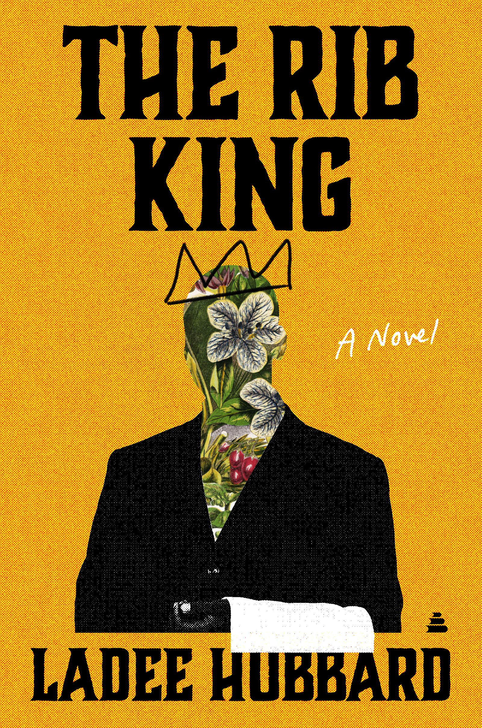 Ladee Hubbard, The Rib King; cover design by Alex Merto (Amistad, January 19)
A satisfyingly irreverent and weirdly beautiful book cover—and a perfect one for a novel about, in part, the way a white family (and white America in general) uses and fetishizes Black faces for its own ends. I particularly love the way the different elements come together as a layered collage, including how the image interacts ever-so-slightly with the text treatment.
 Tove Ditlevsen, tr. Tiina Nunnally and Michael Favala Goldman, The Copenhagen Trilogy; cover design by Na Kim (FSG, January 26)
Na Kim has done it again. I love everything about this cover—the subtle font detail (a kind of clipping effect), the color story and perfectly calibrated tonality, the way Kim has elevated the book cover trope of “a portrait, but cover the eyes” to something surprising, engaging, mysterious, and artful. This is the cover for the omnibus, which came out this month, but FSG is also publishing the three books within as separate volumes; all of them are phenomenal, and they’re even better as a set of four.
Emily Temple
Emily Temple is the managing editor at Lit Hub. Her first novel, The Lightness, was published by William Morrow/HarperCollins in June 2020. You can buy it here.