The 11 Best Book Covers of April
April Showers May Bring Book Covers
Another month of books, another month of book covers. This month, as we took our first hesitant steps back into the world (or at least we said we were going to, on Twitter, whilst still inside), we didn’t forget about all the great books. After all, wouldn’t one of these look pretty smashing in all your new Instagram photos of blooming trees and untanned chins? Just a thought, of course:
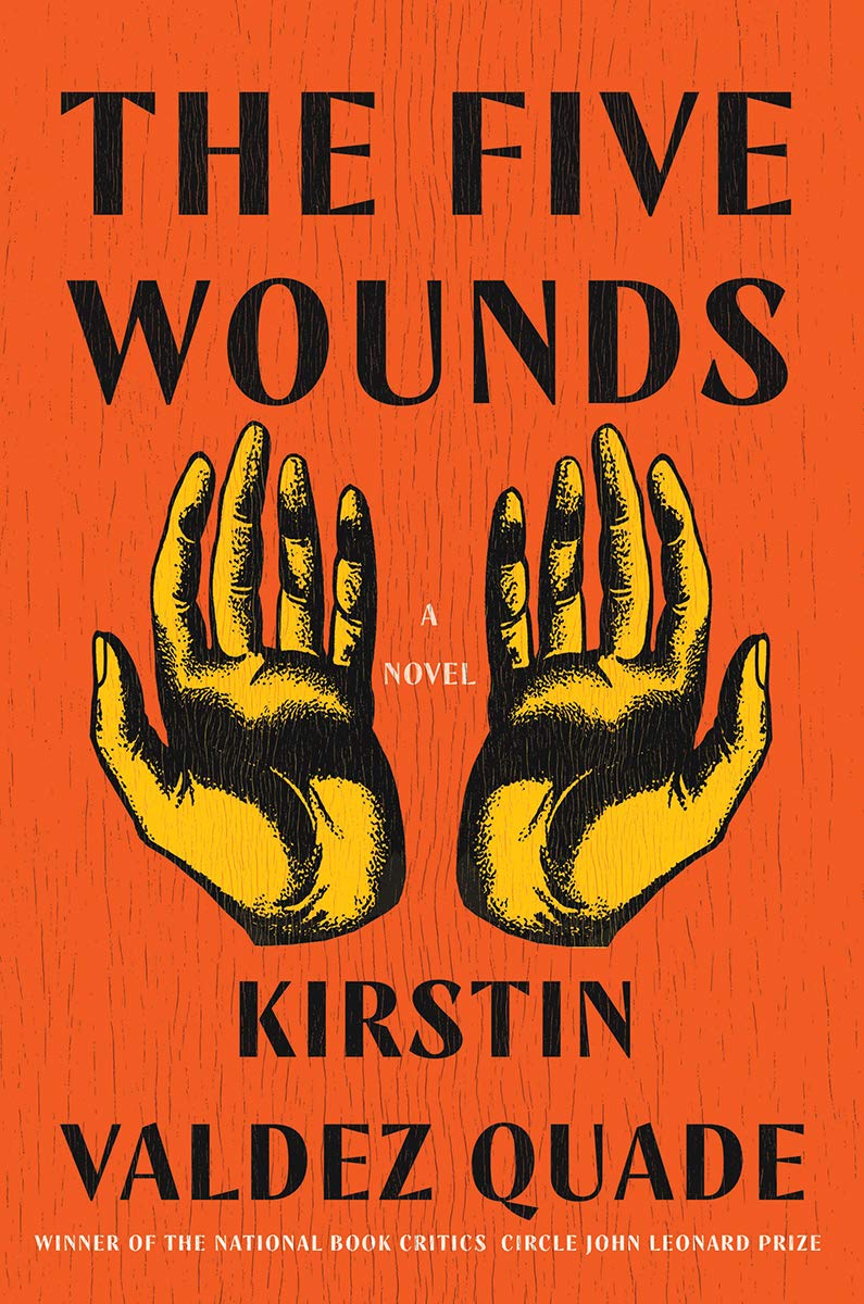 Kirstin Valdez Quade, The Five Wounds; cover design by Gregg Kulick, art direction by Ingsu Liu (W. W. Norton, March 30)
The hands are so striking, especially with this wood-grain texture and bold vintage color story—the book feels like a found object, a kind of talisman; it instantly makes you (or at least me) want to read it.
 Nathaniel Mackey, Double Trio; cover design by Rodrigo Corral (New Directions, April 6)
Corral’s cover for the Mackey box set is top shelf New Directions: beautiful and weird and also weirdly funny—and then you’ve got the covers for the three books inside. Full disclosure: I didn’t see the numbers until I put them all together like this. Consider my mind officially blown:

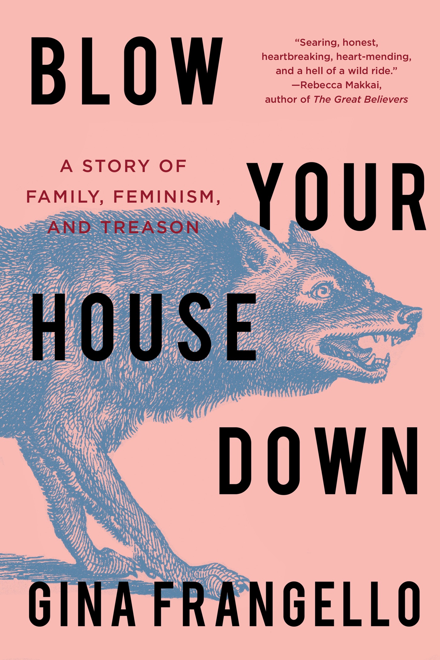 Gina Frangello, Blow Your House Down; cover design by Sarah Brody, art direction by Nicole Caputo (Counterpoint, April 6)
Everything about this cover is subtly excellent: the color choices, which are pleasing but just off enough to create visual interest, the pen and ink wolf, and also the text treatment, with its suggestion of movement, drama, and—dare I say—destruction.
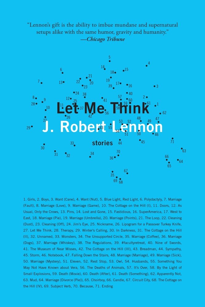 J. Robert Lennon, Let Me Think; cover design by Kyle G. Hunter (Graywolf, April 6)
It’s pretty rare to see a book cover with this much text on it, never mind the titles of all the stories in the collection, so this is worth including for that reason alone. What I want to know but cannot figure: what shape emerges when you connect all the dots?
 Caleb Azumah Nelson, Open Water; cover design by gray318 (Grove Press, April 13)
This sharp horizontal split is also another relative rarity in book covers, and it’s earning its keep here, evoking some real emotion (obviously in conjunction with the photography). I also love the color story here—it feels extremely modern (and not just because of the “Gen Z Yellow”).
 Lauren Hough, Leaving Isn’t the Hardest Thing; cover design by Mark Abrams (Vintage, April 13)
I love it when the custom text becomes the entire illustration—it’s almost like a Magic Eye image, which gives two separate impressions at once. And not for nothing, but the sparks are perfectly placed.
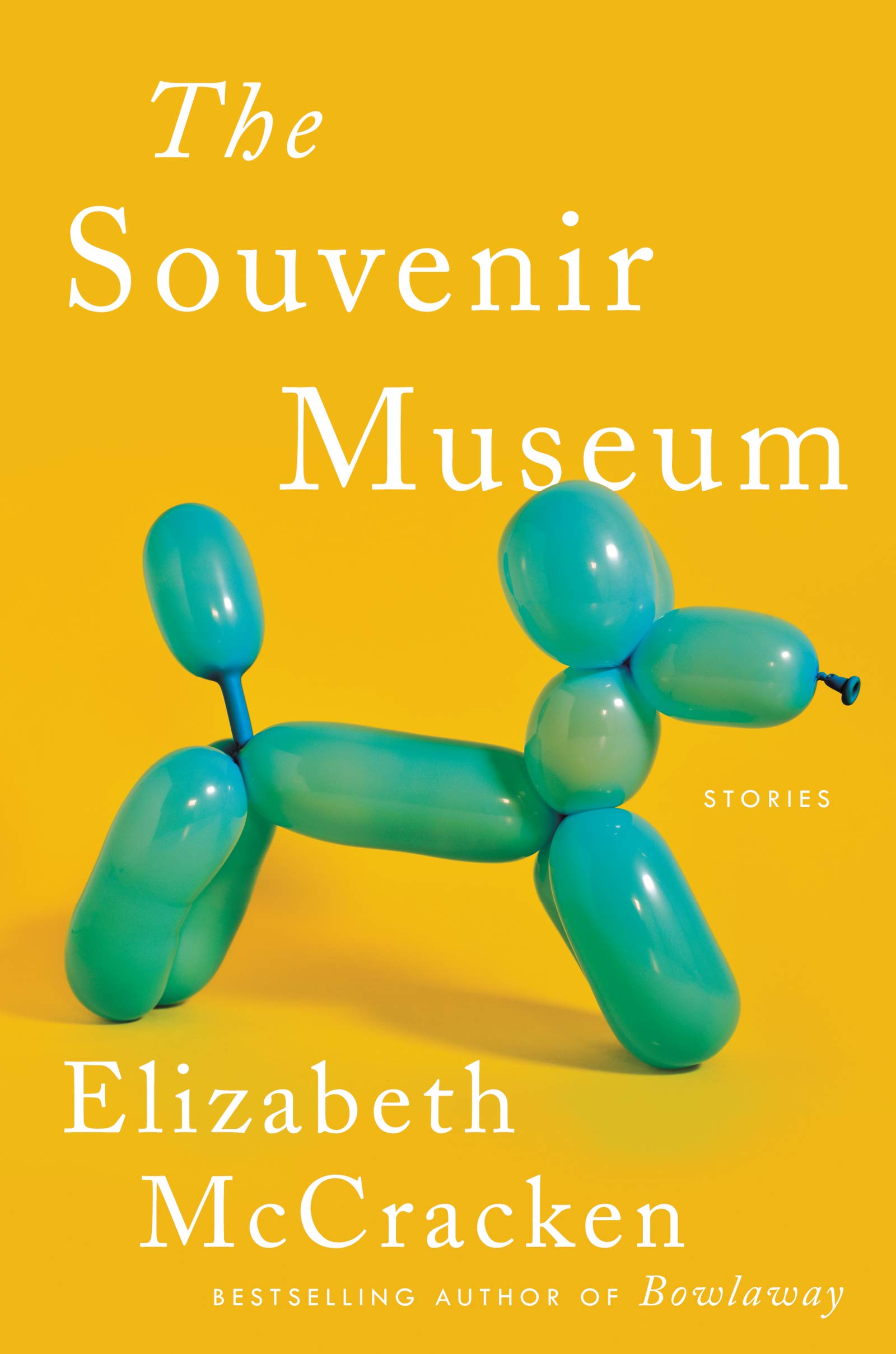 Elizabeth McCracken, The Souvenir Museum; cover design by Allison Saltzman (Ecco, April 13)
Honestly, it just makes me smile—much like McCracken’s writing, now that I think of it. (Also, there’s that Gen Z Yellow again.)
 Leone Ross, Popisho; cover design by Alex Merto (FSG, April 20)
Give me more of this purple cover on book covers, please. I love the exuberance and luxuriousness of this cover, the mix of textures, the fantastical colors and cutouts. It looks like it would be delicious.
 Michelle Zauner, Crying in H Mart; cover design by Na Kim (Knopf, April 20)
This cover is visually arresting, a little funny, a little sweet, and most importantly: perfect for this book. Na Kim never fails, people.
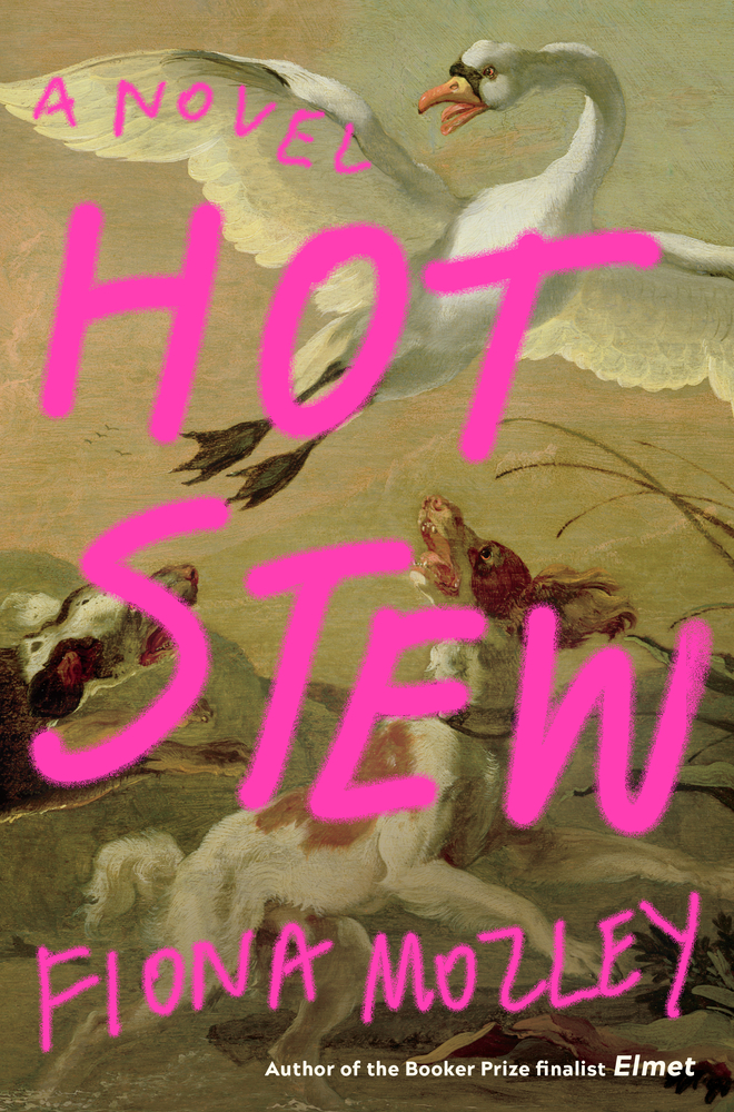 Fiona Mozley, Hot Stew; cover design by Tree Abraham (Algonquin Books, April 20)
I love this one—the classic oil painting juxtaposed with the hot pink spray paint is irreverent and delightful (not to mention a perfect reflection of the novel). The shaky “A NOVEL” actually cracks me up. (Definite My Year of Rest and Relaxation vibes, too.)
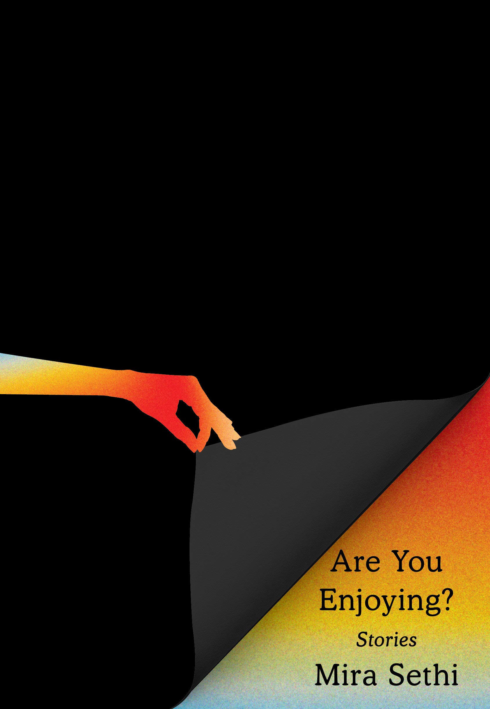 Mira Sethi, Are You Enjoying?; cover design by Janet Hansen (Knopf, April 20)
It’s pretty bold to have a mostly-black book cover, not to mention such a small title. But for me, it completely pays off: not only is this a fun update to the grainy rainbow trend, it immediately projects the attitude of the book.
Emily Temple
Emily Temple is the managing editor at Lit Hub. Her first novel, The Lightness, was published by William Morrow/HarperCollins in June 2020. You can buy it here.